Creating an exceptional ecommerce homepage requires a balance of visual appeal and conversion rate optimization. Studies show quality web design lifts conversions to 400%, yet poor performance leaves 53% of visitors abandoning a site.
This is where an e-commerce development company provides invaluable expertise by blending aesthetics with data-backed best practices around layouts, trust factors, and UX — an experienced eCommerce developer crafts default pages that drive measurable business growth.
Understanding User Behavior
E-commerce default pages must grab attention quickly. Users tend to scan pages in an F-shaped pattern, focusing first on headlines and visuals in a “golden triangle” spanning the top and middle portion of the page. Well-placed calls-to-action catch the eye here. Simplicity is essential, as clutter overwhelms the Viewer and hampers scanning and navigation. Maintaining clean layouts, quality images, and ample negative space directs the Viewer smoothly through critical pages.
Goals of Your Homepage
An exceptional homepage both conveys brand identity and motivates desired actions. It should build awareness, drive sales through clear calls to action, and collect lead data through email signups. This is where partnering with an ecommerce development company is invaluable. By harmonizing visual content and streamlined navigation with conversion rate optimization practices, an experienced ecommerce developer lifts conversion rates across business goals.
Common Homepage Mistakes
- Slow Loading Times: Viewers expect quick access. A delay of just a few seconds can increase bounce rates dramatically. Optimize images and streamline your code to ensure your Entry page loads swiftly.
- Cluttered Layouts: Overloading your Default page with too much information can overwhelm visitors. A clean, organized layout with ample white space enhances readability and guides user focus to essential elements.
- Poor Navigation: Navigation should be intuitive. Complex or hidden menus can frustrate users and lead them to leave your site. Ensure your navigation menu is easy to find and use.
- Weak Call-to-Actions (CTAs): CTAs should be prominent and persuasive. Vague or inconspicuous CTAs should take advantage of the opportunity to guide users toward conversion.
- Ignoring Mobile Users: With the increasing prevalence of mobile shopping, a non-responsive design can alienate a significant portion of your audience. Ensure your Entry page is optimized for mobile devices.
- Lack of Visual Hierarchy: Important information should stand out. Use size, color, and placement to establish a visual hierarchy that directs attention to critical elements.
Visual examples of these mistakes dramatically showcase their impact, emphasizing the need for a well-thought-out homepage design. Avoiding these common pitfalls will create a more engaging, user-friendly, and effective ecommerce homepage.
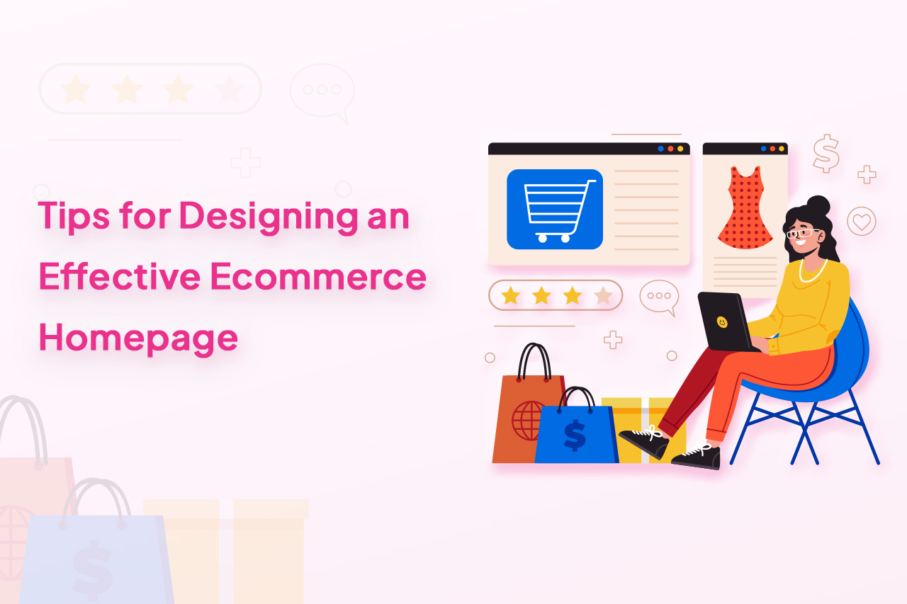
7 Tips for Designing an Effective Ecommerce Homepage
In the evolving landscape of ecommerce, ensuring your Front page is optimized for mobile visitors is not just beneficial; it’s essential. Here’s why prioritizing a mobile-first design and how to implement it effectively is crucial.
Tip 1: Prioritize Mobile-First Design
The rise of smartphones has significantly shifted shopping habits, with mobile commerce now accounting for over half of all online sales. This shift underscores the importance of mobile-first design, emphasizing the need to cater to the growing demographic of consumers who prefer shopping on their devices. A mobile-first approach meets the expectations of a seamless shopping experience and aligns with Google’s mobile-first indexing, affecting your site’s search engine ranking.
Impact on Design Choices
Optimizing for mobile requires a responsive layout that adapts seamlessly to various screen sizes, ensuring content is easily readable and navigation is effortless. Fast loading times are crucial; mobile users are susceptible to delays, with a significant drop in conversion rates for each additional second a page takes to load.
Essential Mobile-Friendly Features
Responsive Layout: A flexible design that adjusts to fit the screen it’s viewed on, improving usability and engagement.
Fast Loading Times: Implementing techniques like image compression, caching, and minimizing code can significantly reduce load times.
Simplified Navigation: A streamlined menu that’s easy to use on small screens, helping users find what they’re looking for without frustration.
Touch-Friendly Interfaces: Design elements such as buttons and links should be easy to tap, avoiding user errors and enhancing the shopping experience.
Case Studies and Data
Mobility Matters: Today’s reality is that most of your customers will engage with your site on the go. Optimizing for mobile isn’t an option anymore – it needs to be the priority.
Embrace Responsive: A responsive web design seamlessly adapts across devices. Inviting navigation, crisp images, and clear CTAs make mobile customers feel at home.
Speed Is King: Fast load speeds increase engagement on mobile. Less friction means customers stick around longer and drive more revenue.
Watch Conversions Climb: Mobile-first is proven to lift key metrics. One major retailer saw a 20% jump in mobile conversions after focusing design efforts on smaller screens.
Tip 2: Craft a Strong Visual Hierarchy
Creating a compelling visual hierarchy on your Shopping site’s Front page is pivotal for meaningfully guiding visitors through your site. This approach helps prioritize content, making it easier for visitors to process information and make decisions swiftly.
A clear structure, combined with strategic use of visual elements, can significantly enhance the user experience, making your site appealing and functional.
Importance of Visual Elements
- Hero Images: A captivating hero image grabs attention immediately, setting the tone for the entire shopping experience. These images should be high-quality and relevant to your target audience, possibly highlighting new arrivals or best-sellers.
- Product Showcases: Carefully curated product showcases can entice customers to explore further. Highlighting featured products or deals directly on the front help drive interest and sales.
- White Space: Utilizing white space effectively is crucial for a clean and uncluttered design. It helps in making the site look organized and improves readability, allowing key elements like CTA buttons and special offers to stand out.
Visually Appealing Examples
Successful ecommerce sites like Apple and Airbnb leverage these principles masterfully. Apple, for instance, uses bold hero images and ample white space to draw attention to its latest products, creating a sleek and inviting Home View page. Similarly, Airbnb uses high-quality photos and a clear visual hierarchy to guide users toward booking their next adventure.
By crafting a solid visual hierarchy and effectively utilizing hero images, product showcases, and white space, you can create a Storefront Front page that captures attention and facilitates a smooth navigation path toward conversion.
Tip 3: Focus on Clear and Concise Navigation
Intuitive navigation is the backbone of a user-friendly E-store Home view page. It streamlines the shopping experience, allowing customers to find what they want with minimal effort. Clear, concise navigation reduces frustration and helps prevent potential customers from leaving your site for easier-to-navigate alternatives.
Importance for User Experience
Effective navigation leads users to their desired products or information, significantly enhancing the user experience. It’s essential for retaining visitors, improving conversion rates, and increasing the time spent on your site.
Effective Menu Styles and Organization
- Menu Styles: Opt for simple, straightforward menu designs that categorize products. Dropdown menus that organize products into easily navigable categories can significantly enhance user experience.
- Search Bars: A prominently placed search bar is crucial for customers who know exactly what they want. It speeds up the shopping process and improves satisfaction.
- Product Category Organization: The logical and intuitive organization of product categories ensures readers can browse offerings without confusion, making the discovery process enjoyable and efficient.
Examples of User-Friendly Navigation Layouts
Ecommerce giants like Amazon and Zara exemplify user-friendly navigation. Amazon’s search bar is central to its layout, complemented by a detailed yet organized menu of categories. Zara uses minimalist menus and high-quality images for categories, making the shopping experience visually appealing and easy to navigate.
By focusing on clear and concise navigation and incorporating effective menu styles, search bars, and well-organized product categories, you can significantly enhance the usability of your Online retail Front page, leading to a more satisfying and productive user experience.
Tip 4: Highlight Your Bestsellers and New Arrivals
Featuring bestsellers and new arrivals prominently on your Online store homepage taps into the psychological tendencies of consumers, leveraging social proof and the allure of novelty to capture interest and encourage purchases. Showcasing popular products validates their desirability while highlighting new arrivals that cater to the consumer’s curiosity and desire for the latest trends.
Psychological Impact
The psychological principle of social proof suggests that people are more likely to engage in an action if they see others doing it. Highlighting bestsellers is an implicit endorsement, encouraging visitors to explore and buy these products. Similarly, featuring new arrivals leverages the novelty effect, drawing attention to the latest offerings and stimulating the desire to own something new and trendy.
Placement Strategies for Maximum Impact
- Hero Banners: Utilizing hero banners to showcase featured products can immediately grab attention as soon as visitors land on your Landing page. This prime real estate is ideal for promoting new arrivals or bestsellers.
- Dedicated Sections: Creating dedicated sections on your Front page for bestsellers and new arrivals ensures they are easily accessible and prominently displayed, encouraging further exploration.
Effectiveness of Showcasing Key Products
Statistics and case studies underscore the value of this approach. For instance, an ecommerce site reported a 20% increase in sales after starting to highlight their bestsellers and new arrivals on the homepage. This boosted conversions and improved the average time spent on the site as customers were more engaged in browsing through these highlighted sections.
Incorporating these strategies into your Landing page design can significantly influence consumer behavior, driving sales and enhancing the overall shopping experience. By strategically placing bestsellers and new arrivals in high-visibility areas, you capitalize on social proof and novelty, enticing visitors to explore and purchase your products.
Tip 5: Build Trust with Social Proof and Testimonials
Social proof powerfully influences buying decisions. Displaying customer reviews, ratings, and testimonials on your homepage builds trust and credibility.
Incorporating feedback directly on your landing page reassures shoppers about product quality and reliability. A dedicated testimonials section or reviews integrated with listings show real customer experiences.
Partnership logos and media mentions enhance perceived brand value too. Data shows products with reviews convert 63% more than those without. This highlights how critical social proof is for convincing hesitant shoppers.
Leveraging genuine customer feedback fosters community and trust around your brand. It persuades visitors that your products are worth buying. Focusing more prominently on social proof makes for a more credible, high-converting homepage.
The key points are:
- Social proof builds trust/credibility
- Testimonials, reviews, ratings = critical for conversions
- Logos and mentions also enhance the brand value
- Vital for turning hesitant visitors into buyers
- Fosters community and connection
Tip 6: Optimize for Search Engines and Internal Linking
SEO (Search Engine Optimization) is crucial for a Digital commerce homepage to increase visibility, attract organic traffic, and enhance user engagement. By optimizing your homepage for search engines, you ensure that potential customers can easily find your site when searching for products or services you offer.
Key Optimization Strategies
- Keyword Optimization: Incorporate relevant keywords naturally into your Home view page content, including titles, headings, and product descriptions, to improve your site’s ranking for those terms.
- Meta Descriptions: Craft compelling meta descriptions for your Landing page that include key phrases. These descriptions appear in search results and can influence click-through rates.
- Internal Linking: Use internal links wisely to guide visitors to other site sections, improving navigation and distributing page authority across your website.
Resources and Tools
For implementing basic SEO practices, tools like Google Analytics and SEMrush offer insights into keyword performance and site traffic, helping refine your strategy. Additionally, plugins like Yoast SEO can guide you in optimizing content and meta descriptions directly within your website’s content management system.
Optimizing your Digital storefront for search engines through strategic keyword use, compelling meta descriptions, and intelligent internal linking can significantly improve your site’s visibility and Customer experience, increasing traffic and conversions.
Tip 7: A/B Test and Iterate
A/B testing is key for improving your online store’s performance. It involves testing two versions of a landing page to see which works better for getting visitors to take desired actions.
You can test elements like button colors, headlines, or page layouts. This shows what resonates most with your audience. The data lets you make informed decisions to enhance the site experience and increase conversions.
Commit to regularly A/B testing your landing pages. This iteration keeps your site feeling fresh and relevant. It ensures your store continually evolves to meet changing customer needs and preferences.
The focus is on the value of continuously testing and improving store pages based on data. The language is simplified for ease of reading. Please let me know if you would like any clarification or have additional suggestions for improving the tip.
FAQs on Ecommerce Homepage Design
1. How often should I redesign my homepage?
Redesigning your website should be based on performance metrics and customer feedback rather than a set schedule. However, a good rule of thumb is to reassess and potentially update your design every 2-3 years to stay current with design trends and technological advancements.
2. What are some common design trends for ecommerce homepages?
Current trends include minimalistic designs with ample white space, bold and large typography, dynamic and interactive elements like micro-animations, and immersive full-screen images or videos that tell a brand story.
3. How can I personalize my homepage for different user segments?
Leverage data analytics to understand your audience segments. Use AI and cookies to display personalized content, products, or offers based on the user’s past behavior, demographics, and preferences.
To Conclude
In conclusion, designing an effective Online marketplace homepage involves a strategic blend of aesthetics, functionality, and continuous optimization. From prioritizing a mobile-first approach to leveraging social proof and conducting A/B tests, each tip offers a pathway to captivate visitors and convert them into loyal customers.
Implementing these strategies requires patience, experimentation, and a keen eye for user experience. Remember, the goal is to create a welcoming digital storefront that reflects your brand, meets user needs, and stands out in the competitive ecommerce landscape.
For those looking to take their e-commerce site to the next level, Hiring an ecommerce developer within such a company allows you to tap into this expertise and achieve your specific goals, whether boosting conversion rates, improving mobile performance, or seamlessly integrating complex functionalities.
Take action today by applying the insights shared in this guide. Continuous learning and adaptation are crucial to ecommerce success, so stay informed on trends, listen to your users, and always strive for improvement.
Author Bio
Priyanka Prajapati, a dedicated Content Manager at Brainspate – An eCommerce Development Company since 2023, thrives on her love for e-commerce. With engaging writing, she enlightens readers, leaving an indelible impact on the digital landscape.